LabCanvas

LabCanvas Graphs & statistics: 50 scientific graph types with checked statistics

A visual guide to LabCanvas Graphs & statistics: Prism-style data tables, 50 graph types from scatter dot plots to Kaplan–Meier, volcano and PAE plots, t tests, ANOVA, curve fits and survival tests checked against SciPy, and graphs that stay linked to their figure.
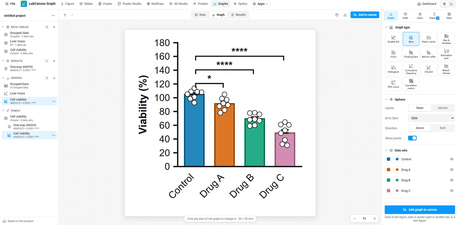
LabCanvas Graphs & statistics with a cell viability graph, a one-way ANOVA and significance brackets
Graphs & statistics in LabCanvas. Open it in your browser.
Contents

LabCanvas Graphs & statistics is a data analysis and graphing app in the style of GraphPad Prism. Data go into typed tables (column, XY, grouped, survival or contingency), analyses run on them and graphs draw from them, with significance brackets placed from the test results. There are 50 graph types, and every statistical method is checked against SciPy and statsmodels in automated tests. Graphs go into figures as editable vectors that stay linked to their data.

Every graph type, by category

Each picture below was drawn by the app from its example data, exactly as it appears when you pick the graph type. Open the app and the same graphs are one click away.

Column
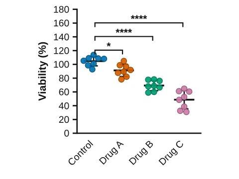
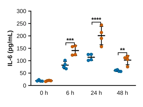
Scatter dot plot made in LabCanvas Graphs: Every value, with the mean and SD
Scatter dot plot
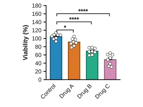
Bars with points made in LabCanvas Graphs: Mean ± SEM bars with every value on top
Bars with points
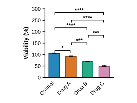
Bar chart made in LabCanvas Graphs: Mean ± SEM
Bar chart
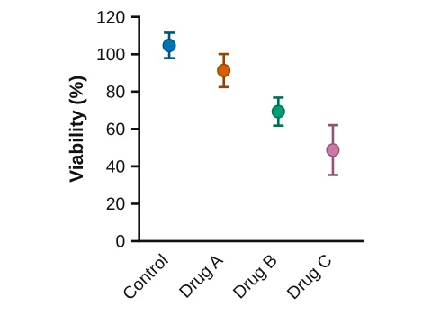
Mean ± SD made in LabCanvas Graphs: A symbol at each mean with SD error bars
Mean ± SD
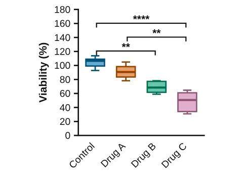
Box & whiskers made in LabCanvas Graphs: Median, quartiles and Tukey whiskers
Box & whiskers
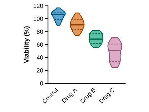
Violin plot made in LabCanvas Graphs: The distribution with median and quartiles
Violin plot
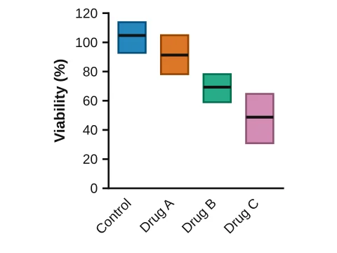
Floating bars made in LabCanvas Graphs: Minimum to maximum with the mean
Floating bars
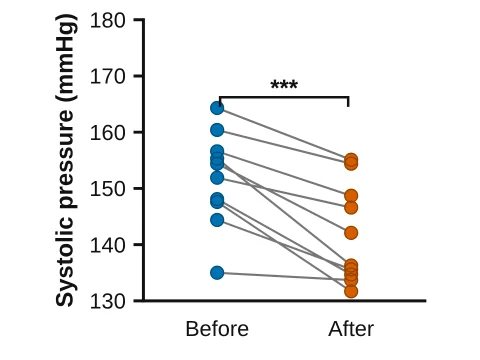
Before–after made in LabCanvas Graphs: Paired values joined by lines
Before–after
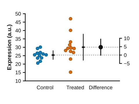
Estimation plot made in LabCanvas Graphs: Two groups and the difference with its 95% CI
Estimation plot

XY

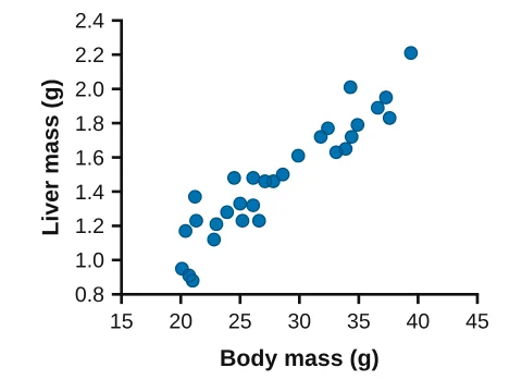
XY scatter made in LabCanvas Graphs: Points with X and Y values
XY scatter
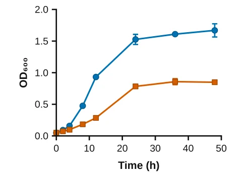
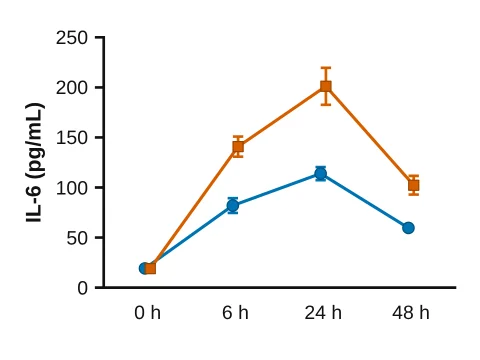
Line graph made in LabCanvas Graphs: Mean ± SEM joined by lines
Line graph
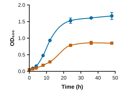
Smooth curve made in LabCanvas Graphs: A spline through the means
Smooth curve
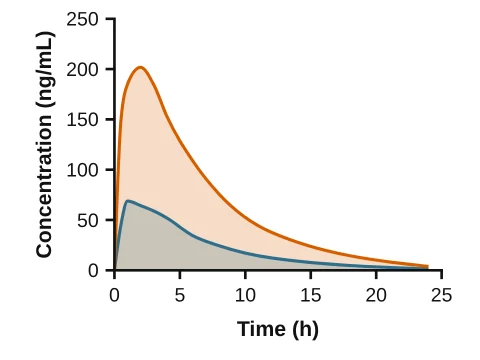
Area chart made in LabCanvas Graphs: Lines with the area below filled
Area chart
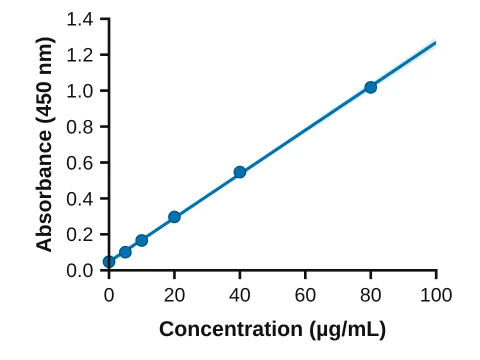
Linear regression made in LabCanvas Graphs: Best-fit line with its 95% confidence band
Linear regression
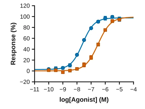
Dose–response curve made in LabCanvas Graphs: Sigmoidal fit with EC₅₀
Dose–response curve
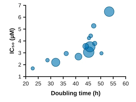
Bubble plot made in LabCanvas Graphs: Bubble size from a second data set
Bubble plot

Grouped

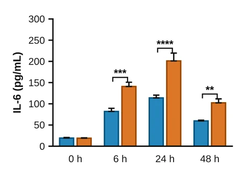
Grouped bars made in LabCanvas Graphs: Mean ± SEM side by side in each row
Grouped bars
Grouped scatter made in LabCanvas Graphs: Every replicate, side by side
Grouped scatter
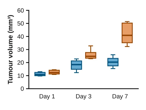
Grouped box plot made in LabCanvas Graphs: Box & whiskers side by side in each row
Grouped box plot
Time course made in LabCanvas Graphs: Means joined across rows
Time course
Stacked bars made in LabCanvas Graphs: Means stacked in each row
Stacked bars
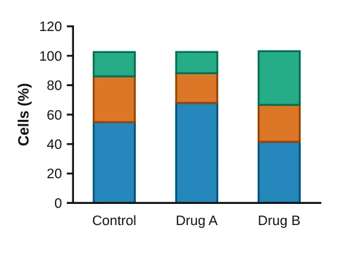
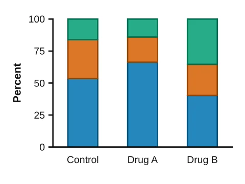
100% stacked bars made in LabCanvas Graphs: Each row as percentages
100% stacked bars
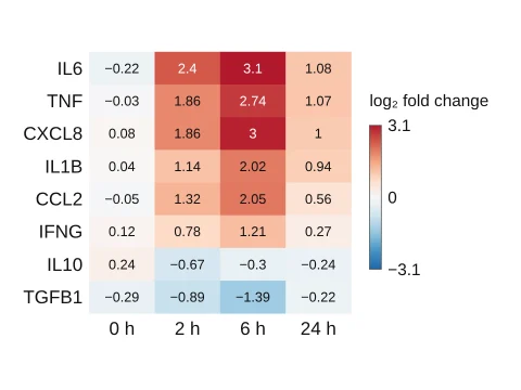
Heat map made in LabCanvas Graphs: Rows × data sets coloured by value
Heat map
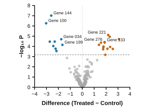
Volcano plot made in LabCanvas Graphs: A t test per row; discoveries by false discovery rate
Volcano plot

Distributions

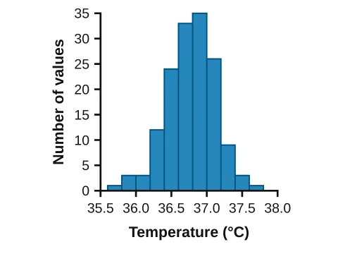
Histogram made in LabCanvas Graphs: Frequency distribution
Histogram
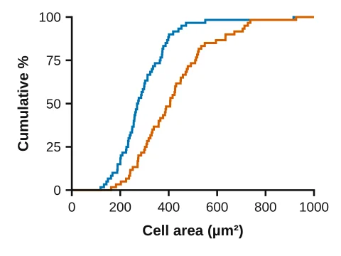
Cumulative frequency made in LabCanvas Graphs: Cumulative distribution of each column
Cumulative frequency
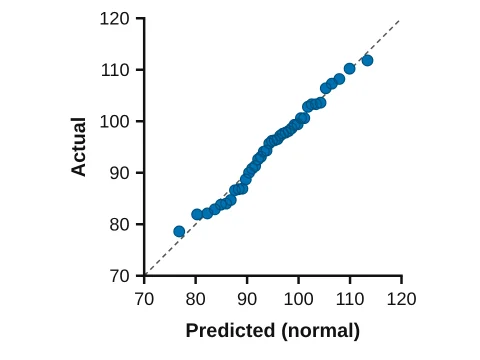
QQ plot made in LabCanvas Graphs: Is it normal? Actual vs. predicted values
QQ plot

Survival

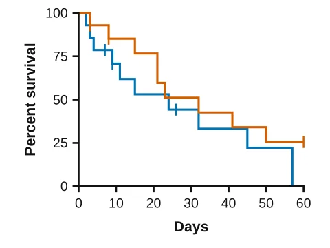
Kaplan–Meier made in LabCanvas Graphs: Survival curves with censor ticks
Kaplan–Meier
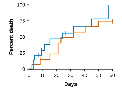
Cumulative incidence made in LabCanvas Graphs: Percent with the event over time
Cumulative incidence

Contingency

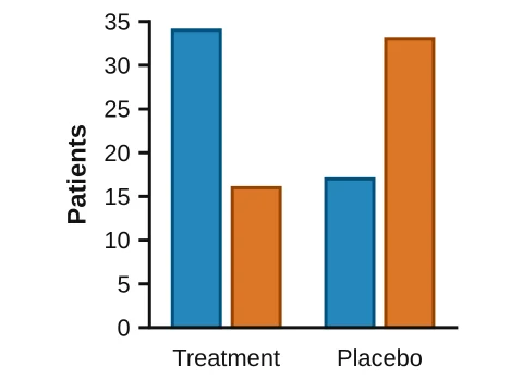
Counts by group made in LabCanvas Graphs: Outcome counts or % side by side
Counts by group
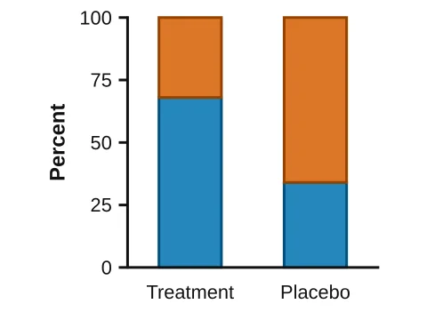
Stacked percentages made in LabCanvas Graphs: Outcomes as % of each group
Stacked percentages

Parts of whole

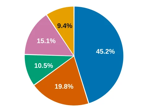
Pie chart made in LabCanvas Graphs: Fractions of a whole
Pie chart
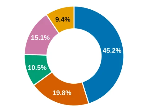
Donut chart made in LabCanvas Graphs: A pie with a hole
Donut chart
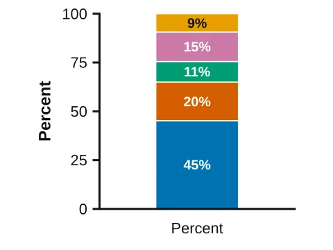
100% bar made in LabCanvas Graphs: Parts stacked in one bar
100% bar

Methods & diagnostics

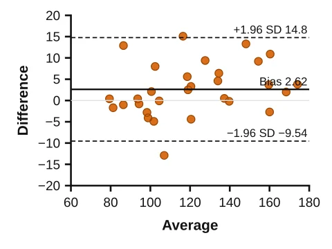
Bland–Altman made in LabCanvas Graphs: Agreement of two methods
Bland–Altman
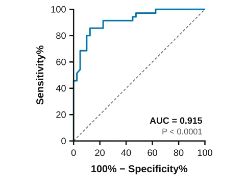
ROC curve made in LabCanvas Graphs: Diagnostic accuracy with the area
ROC curve
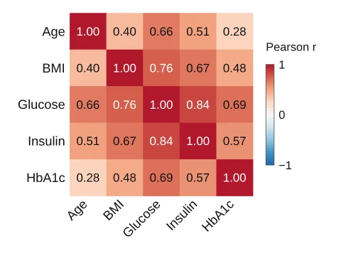
Correlation matrix made in LabCanvas Graphs: Pearson r of every pair of variables
Correlation matrix

Proteins & drug discovery
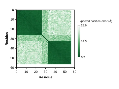
Predicted aligned error PAE made in LabCanvas Graphs: AlphaFold-style matrix: low error within domains, high between them
Predicted aligned error PAE
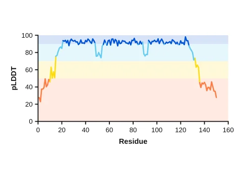
Per-residue confidence pLDDT made in LabCanvas Graphs: Confidence along the sequence in the AlphaFold colour bands
Per-residue confidence pLDDT
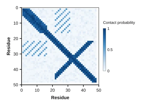
Contact map made in LabCanvas Graphs: Predicted residue–residue contact probabilities
Contact map
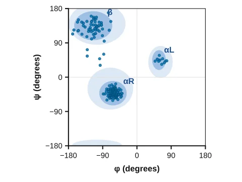
Ramachandran plot made in LabCanvas Graphs: ψ against φ with the favoured and allowed regions
Ramachandran plot
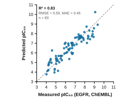
Parity plot ML model made in LabCanvas Graphs: Predicted vs. measured potency with R², RMSE and MAE
Parity plot ML model
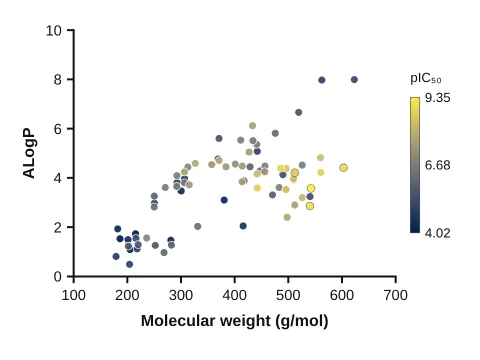
Chemical space map made in LabCanvas Graphs: Compounds by weight and lipophilicity, coloured by potency
Chemical space map
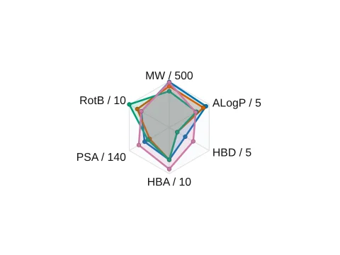
Property radar drug-likeness made in LabCanvas Graphs: Each property as a fraction of its rule-of-five limit, one polygon per drug
Property radar drug-likeness
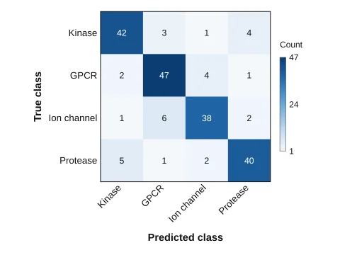
Confusion matrix made in LabCanvas Graphs: Classifier counts: true class by row, predicted by column
Confusion matrix
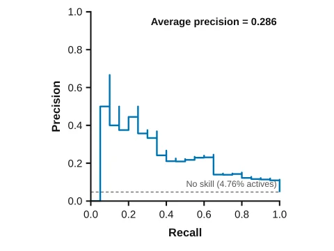
Precision–recall curve made in LabCanvas Graphs: Virtual screen or classifier: precision against recall with average precision
Precision–recall curve
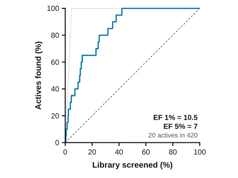
Enrichment curve made in LabCanvas Graphs: Actives found against library screened, with EF 1% and EF 5%
Enrichment curve
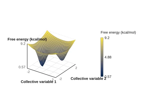
3D free energy landscape made in LabCanvas Graphs: Energy over two collective variables as a surface
3D free energy landscape
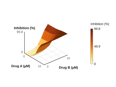
Drug combination surface made in LabCanvas Graphs: Response over two drug doses as a 3D surface
Drug combination surface
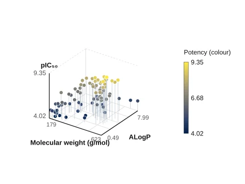
3D scatter made in LabCanvas Graphs: Three properties per compound, coloured by a fourth
3D scatter

Statistics you can check

AnalysisMethods
Compare two groupsUnpaired and paired t tests, Welch’s t test, Mann–Whitney, Wilcoxon
Compare several groupsOne- and two-way ANOVA, repeated measures, Kruskal–Wallis, Friedman; post-hoc tests such as Tukey, Dunnett and Šidák
RelationshipsLinear regression, correlation, nonlinear curve fits including dose–response (EC50/IC50)
SurvivalKaplan–Meier curves, log-rank test, median survival
ContingencyChi-square and Fisher’s exact test, odds and risk ratios
DiagnosticsROC curves with AUC, Bland–Altman agreement, QQ plots

Results are validated against SciPy and statsmodels in 1,033 automated checks.

How to run a one-way ANOVA with post-hoc tests

  1. Open Graphs & statistics and pick Bars with points (Column).
  2. Type or paste your values into the column table, one column per group.
  3. In the Stats tab choose one-way ANOVA and Tukey or Dunnett comparisons.
  4. Significance brackets appear on the graph; adjust their style in the panel.
  5. Click Add to figure to place the graph, still linked to its data.

Choosing a graph

  • Show every point when groups are small (n < 20): scatter dot plots or bars with points.
  • Box and violin plots show the spread of larger samples.
  • XY graphs for time courses and dose–response curves; fit the curve rather than joining the dots.
  • Survival data belong in Kaplan–Meier curves with the number at risk.
  • Matrices (heat maps, correlation, PAE and contact maps) need a colour scale with a labelled range.

Frequently asked questions

Is LabCanvas Graphs an alternative to GraphPad Prism?
It works in the same way: data tables (column, XY, grouped, survival, contingency), analyses and graphs in a project navigator, with significance brackets drawn from the tests. It runs in the browser and its graphs go straight into LabCanvas figures.
Which statistical tests are there?
t tests (paired and unpaired), one- and two-way ANOVA with Tukey, Dunnett, Šidák and other post-hoc tests, nonparametric tests (Mann–Whitney, Wilcoxon, Kruskal–Wallis), linear and nonlinear regression including dose–response curves, log-rank survival tests and contingency tests (chi-square, Fisher).
How do I know the statistics are right?
Every analysis is checked against SciPy and statsmodels in 1,033 automated tests that run on every change to the app.
Can I paste data from Excel?
Yes. Copy cells in Excel or Google Sheets and paste them into a data table; the table grows to fit.
Do graphs update in my figure when the data change?
Yes. Add to figure places the graph as editable vectors that stay linked to the data, so a corrected value updates the figure it sits in.
scientific graphsstatisticsGraphPad Prism alternativeANOVAKaplan-Meiervolcano plotdose-response curve

Try it in LabCanvas

Every app is free to start in your browser. Create an account and begin.

Open Graphs & statistics